Friday, 23 November 2012
Second Ancillary task brief
As part of the promotion package design a magazine advert for the digipak (CD/DVD package)

Wednesday, 21 November 2012
Finished digipak
Here is the finished Digipak.


The final digipak differs from earlier designs slightly as the back cover and one of the inside panels now have a black background as oppose to a white one. We also changed the colour of the font on the back panel from red to white. The reason we made these changes is that the photos and text now stand out more and also the text is now clearer and easier to read.
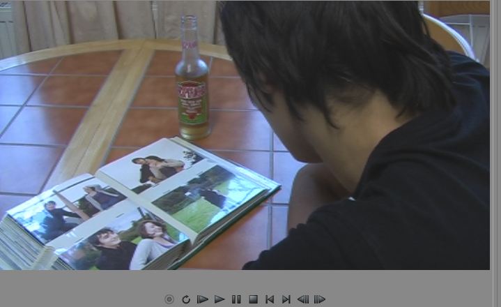
We added a photo collage of images from various film shoots and video footage because it adds to the song's feel of nostalgia and looking back as well as linking with our use of a photo album in the video itself. The reason we have an image of the artist as the digipak's main image is because it's a generic convention of the rock genre to have the artist on the album cover.
Creating the digipak
Creating the digipak started with designing the back cover:
Here is the draft:
To start with adding a black background to the cover and then a red font to the track list, in order to really make it stand out and grab the buyers attention. Next we added the conventional copyright information and bar code as well as a smartphone scanner and web address for the artist's official website.





We then created a photo collage of various photos from either the video itself, screen shots from filming sessions and photos especially for the digipak.

I thought this was a good idea as it links with the idea of a photo album used in the music video and it also fits a convention as the main image of the panel is artwork that's some how relevant to the album or artist.
Here is the draft:
To start with adding a black background to the cover and then a red font to the track list, in order to really make it stand out and grab the buyers attention. Next we added the conventional copyright information and bar code as well as a smartphone scanner and web address for the artist's official website.

Here is the back cover after we'd finished. Next we took some photos to add to the digipak and felt that this one was the most appropriate for the back cover.


Here is the finished back cover:

We altered the contrast of the photo and laid part of the track list over it to make the text stand out even more. Overall I'm very happy with the back cover as it looks good and fits some of the conventions of the genre.
Next we moved on to the front cover. This is the draft.

The first thing we did was add text to the design with the names of the artist and album running down either side of the main image. We broke a generic convention here as all text on the front cover is the same size, this influenced what font we chose because if all text is the same it needs to stand out and we felt using bold black text on a white background along with the main image really makes it stand out. I feel having all text the same size is a good idea because as much as the artist wants to market themselves they are still trying to sell an album and therefore I feel both deserve equal coverage. Finally we added a photo of the artist, the reason we chose this photo is because often solo artists, like Bryan Adams use photos of themselves on thier album covers to try and promote themselves to the best of thier ability. The reason we had Will pose this way is because often the main image is of the artist looking confident and laid back, this was a theme we felt fit the song and this photo was ther best option overall I'm very happy with what we came up with.


For the inside panels the first thing we did was add two images.
This photo was then placed under the CD itself.

The reason we chose this photo is that often in rock albums you see photos of the artist in this kind of pose, with their heads down and leant against a wall, as it shows a deeper more emotional side to the artist and we felt it worked well with our front cover as it reflects the two sides of the artist really well.

We then created a photo collage of various photos from either the video itself, screen shots from filming sessions and photos especially for the digipak.

I thought this was a good idea as it links with the idea of a photo album used in the music video and it also fits a convention as the main image of the panel is artwork that's some how relevant to the album or artist.
Final choice for digipak
After sketching various drafts for our digipak and receiving feedback back the class we have decided to produce a digipak that is a blend of all are drafts.


This draft of the singer sat near or on an amp will be the main image of the front cover as it was the strongest idea during the feedback session and it's conventional as the main image is the artist.
This will be the back cover as it follows the conventions of having a track list, bar code and copyright information all on the back. Also out of all the drafts it's the most easily changed without losing the original idea.

This will be the inside panels because the design is fits the convention of having some form of imagery on the inside panels. We now know thanks to the feedback session that the digipak as a whole will be marketed as a single rather than an entire album, this means that the main images will be from the music video itself or footage that hasn't been used in the video as it links with the photo album concept from the music video.
Tuesday, 20 November 2012
Analysis of a student digipak
The student digipak I'm going to analyse is "American girls"


THE FRONT
The front cover of the digipak fits the convention of having an image of the artist as the main image of the front cover, I also find the image interesting as the photo was taken at one of the locations used in the music video. Another thing I like about the front cover is the text used because I feel it links well with the video as it's quite a feminine looking font and therefore links with the song's title "American girls". However the text doesn't fit the generic convention of rock digipaks as the text is the same size and the convention is that the Artist's name is bigger than the name of the album.
THE BACK

One convention that the back cover of the digipak doesn't follow is that there isn't a track list, however I feel this can be justified as the digipak is set out as a DVD of a specific song's music video so a track list would be unnecessary. To compensate the song lyrics have been written on the back cover, however this is also unconventional as if song lyrics are included in a digipak there are conventionally seen on the inside panels. One convention that is followed is that the main images of the back cover are photos of the band and images that are relevant to the band or album which in this case is a photo of the american flag. The convention of having copyright information on the back panel is also met.
THE INSIDE PANELS

The only feature of the inside panels is an image of the american flag, which is conventional as often the main image of the inside panels is orginal artwork that is relevant to the album. However it's also unconventional when used in this way as because it is the only thing in the inside panels the digipak neglects the conventions of having song lyrics and photos of the artist all in the inside panel.
THE SPINE
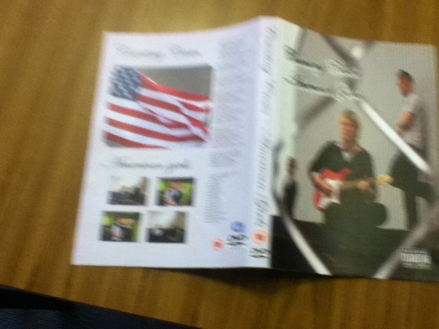
The spine follows the convention of having the names of the artist and the album however because the digipak is a DVD not a CD there isn't a record label logo instead there is a DVD logo and a rating certificate, however like the front cover the text breaks the convention of having the artist's name bigger than the album's name as once again all text is the same size.
Feedback to digipak drafts


After showing our draft designs to the class this is the feedback we recieved:
That the class liked our idea of using photos of the lead singer on the front cover and our idea to have the text down the side rather than the traditional top of the front cover. However the class did suggest that we have the digipak as a single rather than an entire album and then use images from the video itself for the inside panels. For example screen shots from the photo album or couple scenes.

Monday, 19 November 2012
Analysis of a digipak #2
The digipak I'm going to analyse is "Black Ice" by AC/DC.

THE FRONT
The front cover follows the convention of having the artist's name as the biggest piece of text on show with the album's name being smaller and also below the name of the artist. Another generic rock convention the front cover of "Black Ice" follows is having a colour scheme involving no more than three colours, which in this the case is a colour scheme of silver, grey and black. One convention that isn't followed is having an image of the artist on the front cover, instead the main images on the front cover are the band's logo and orginal artwork. However part of this orginal artwork is a picture of the band's guitarist (Angus Young) striking a pose that is heavily associated with him, but as it isn't the main image of the front cover or a conventional photo I feel the convention is not followed.

THE BACK

The generic conventions for a rock digipak that the back cover of "Black Ice" follows are:
Maintaing the conventional colour scheme of the front cover, (Silver, grey and black). However one thing I feel is unconventional is although they have followed the conventions of keeping the colour scheme and having the tracklist on the back cover, they haven't altered the text or the font of the tracklist to make it stand out against the background. This means that it can be difficult to read in certain light. Another convention that the back panel doesn't follow is that it doesn't have a photo of the artist instead like the front cover, the back panel's main image is orginal artwork that involves members of the band in significant poses, for example Brian Johnson leaning back as he sings.

A convention the back cover does follow is having the barcode and copyright information all on the back cover. As well as a link to the artist's offical website, www.AC/DC.com and information about the record label (Columbia) and the distributor (SONY entertainment).


The spine follows the generic conventions of having the same conventional colour scheme as the rest of the digipak, as well as having the names of the album, the artist and the record label. The album's serial number being on the spine is another convention the digipak follows. One convention the spine of "Black Ice" doesn't follow is having the artist's name bigger than the name of the album, instead both are the same size.

THE INSIDE PANELS

Like the front and back cover the inside panels don't follow the convention of having an image of the artist, instead once again using a piece of orginal artwork of a band member, which in this case is the band's guitarist Angus Young. However one convention that the digipak's inside panel does follow is by having a booklet within the inside panels. These booklets conventionally contain song lyrics or photos of the band, in the case of "Black Ice" photos of the band are used.

Another convention the inside panels follow is continuing the conventional colour scheme to the poin where it's used on the CD itself.


Subscribe to:
Posts (Atom)